Johma
The name HOMANN stands for enjoyment, quality and down-to-earth mentality. For loving what you do and being able to look back on more than 100 years of experience. You get the best recipe by using the best ingredients. Be it potatoes, pasta, oil, herring or spices: all raw materials are subjected to strict quality controls and come from close by whenever possible.
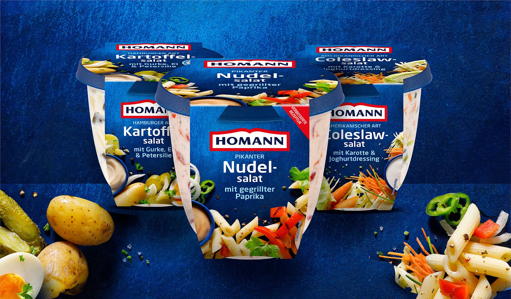
HOMANN asked REGGS to develop an updated packaging line for side dishes such as the Kartoffelsalat.
PHOTOGRAPHY
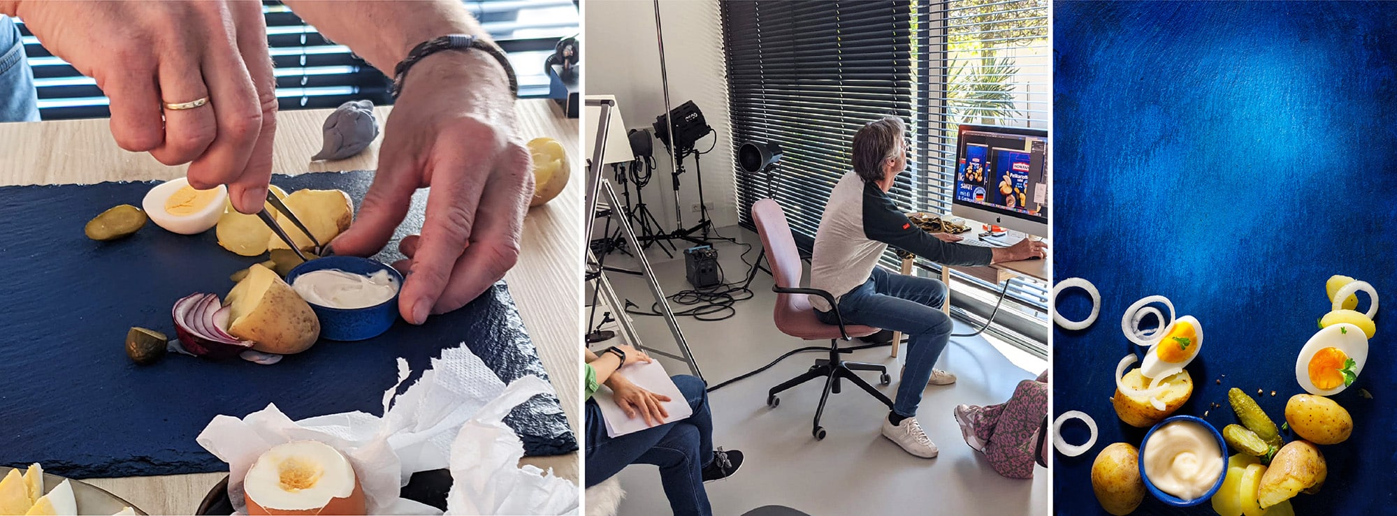
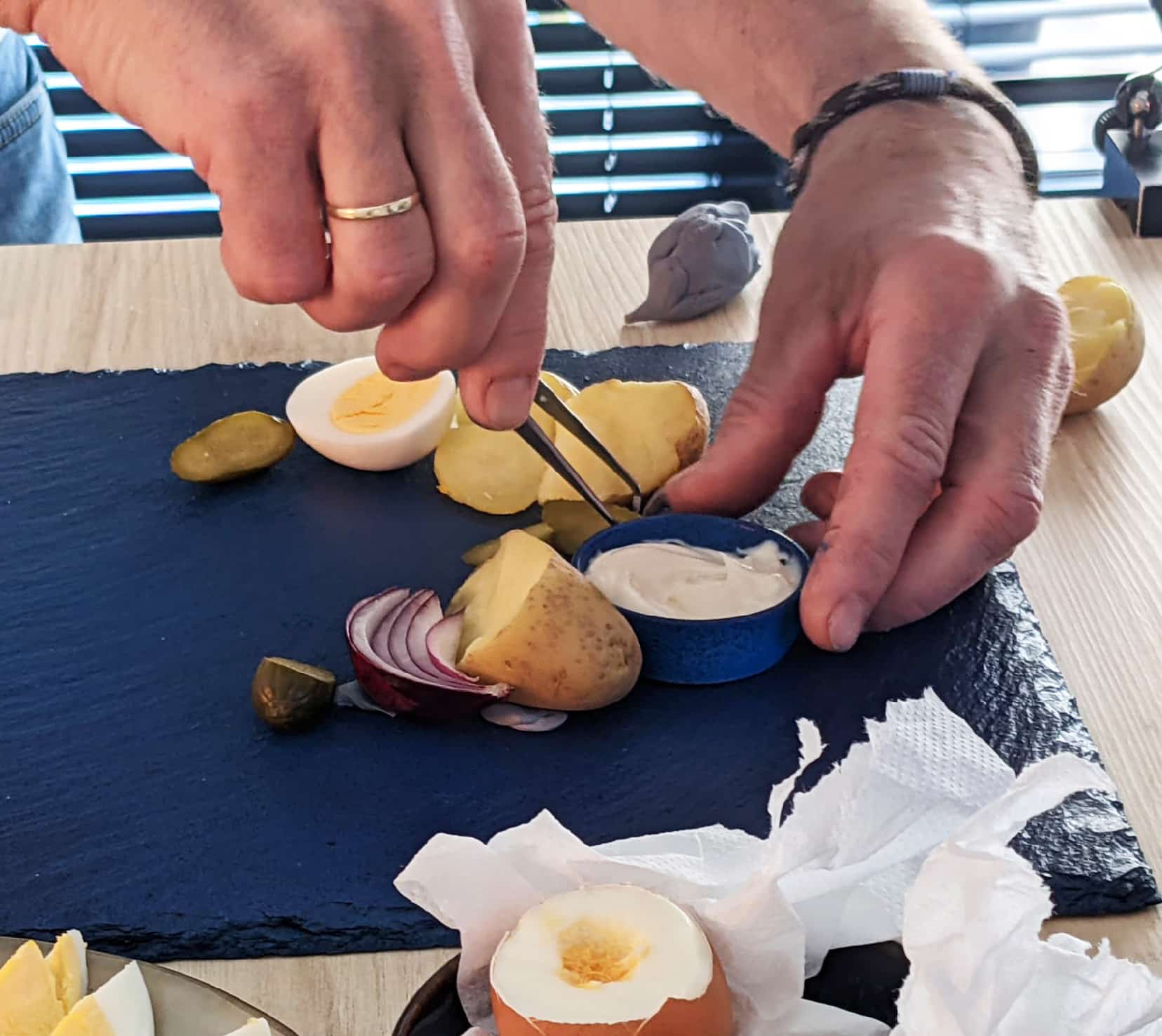
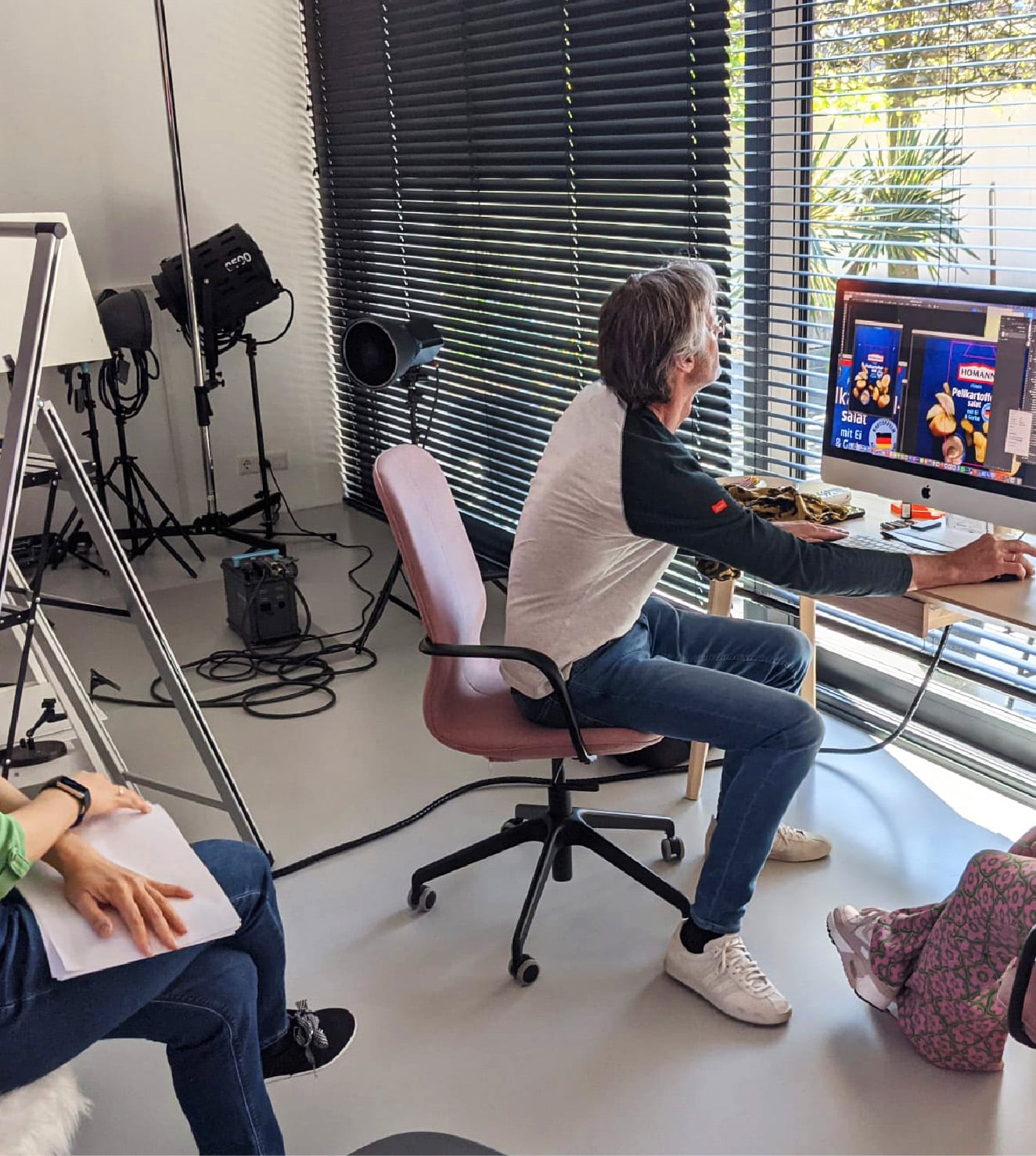
Entirely new photography was developed for the new packaging in collaboration with Jan Schartman. This gives the pure, local ingredients the stage they deserve. On stage, the "Kartoffelen aus Deutschland" play the leading role.

RESEARCH:
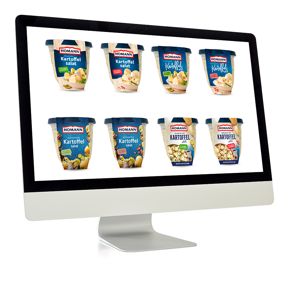
For Homann, we did research on how to modernize the brand on the packaging without losing the heritage. Together we looked for a design that is better structured and easier to read. During our research , we looked at how different designs on the shelves would come across to the customer and from what distances the texts would be readable.

THE SOLUTION
The step we took was further away from the original than we initially thought, but the result is worth it. In the new packaging line design, the deep color blue is the hero. Based on the updated design of HOMANN's Bread and Toast, this use of color adds depth and light to the design. The blue is reflected in the texture and background den and makes the typography more legible.
THE RESULT.
The result is a packaging line with a very clear hierarchy with improved legibility. The line reinforces the HOMANN brand's position on the shelf with blue as the main color. The new photography pays tribute to the quality of the ingredients and makes it tasteful and attractive to consumers.