hide
Bakkerij Van Vessem is an ambitious bakery with 16 branches from Hoofddorp and Amsterdam to Haarlem and Castricum. Baker Jos Huijbregts highly values craftsmanship and his bakery has been a familiar face in the neighborhood for 113 years. For some a tasty daily sandwich, for others a loaf of grain from Groningen or just a tompouce. What makes Bakkerij van Vessem special? The ambition to bake the tastiest bread in a sustainable and artisan way.
hide
How do you convince consumers that there really is a good reason to go to the bakery?
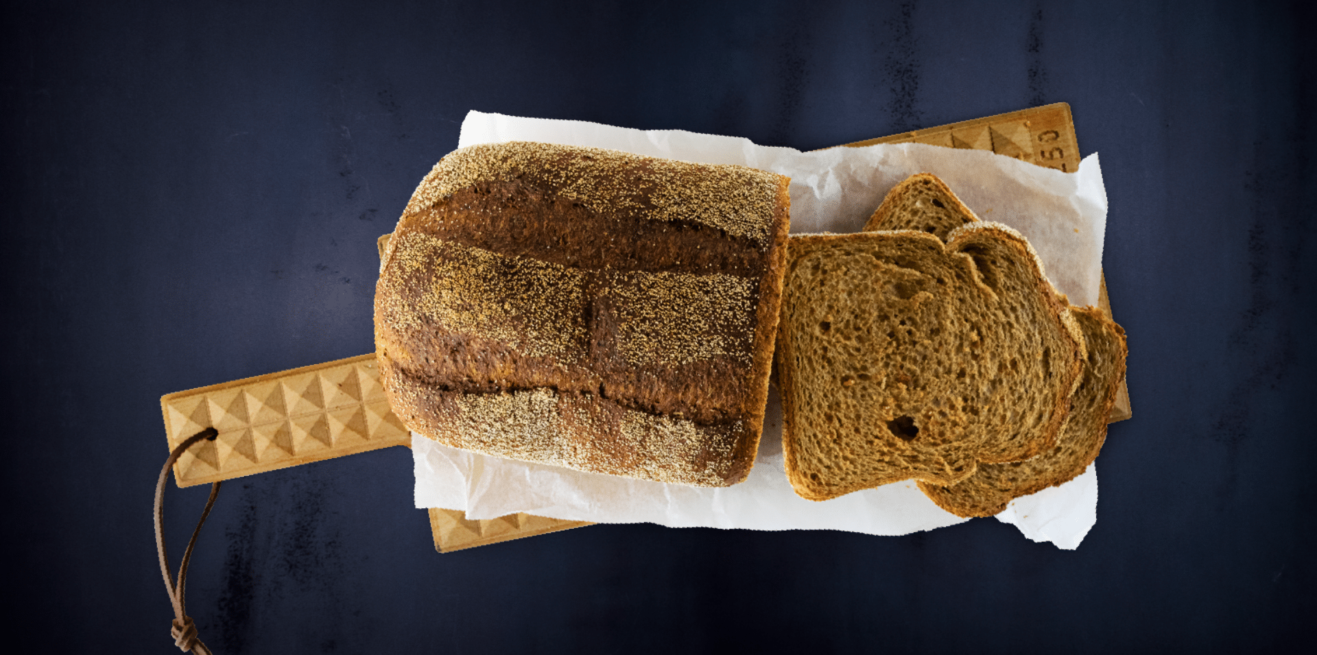
That sounds strange, because a loaf of bread is natural by definition, right? Nothing could be further from the truth, because a loaf of bread is sometimes baked with raw materials whose origin is not clear. Also, flavor enhancers and other additives are often used to make the product last longer and "tastier".
In addition, the landscape of "bread from the baker" has changed with the professionalization and expansion of the assortment of the bread department at the supermarket. There are also more and more alternatives for that breakfast moment. That's why Bakker Jos came to us with a clear goal: to enable as many people as possible to enjoy the tastiest bread at a fair price. The question to REGGS was therefore: "How do you convince consumers that there really is a very good reason to go to the bakery?"
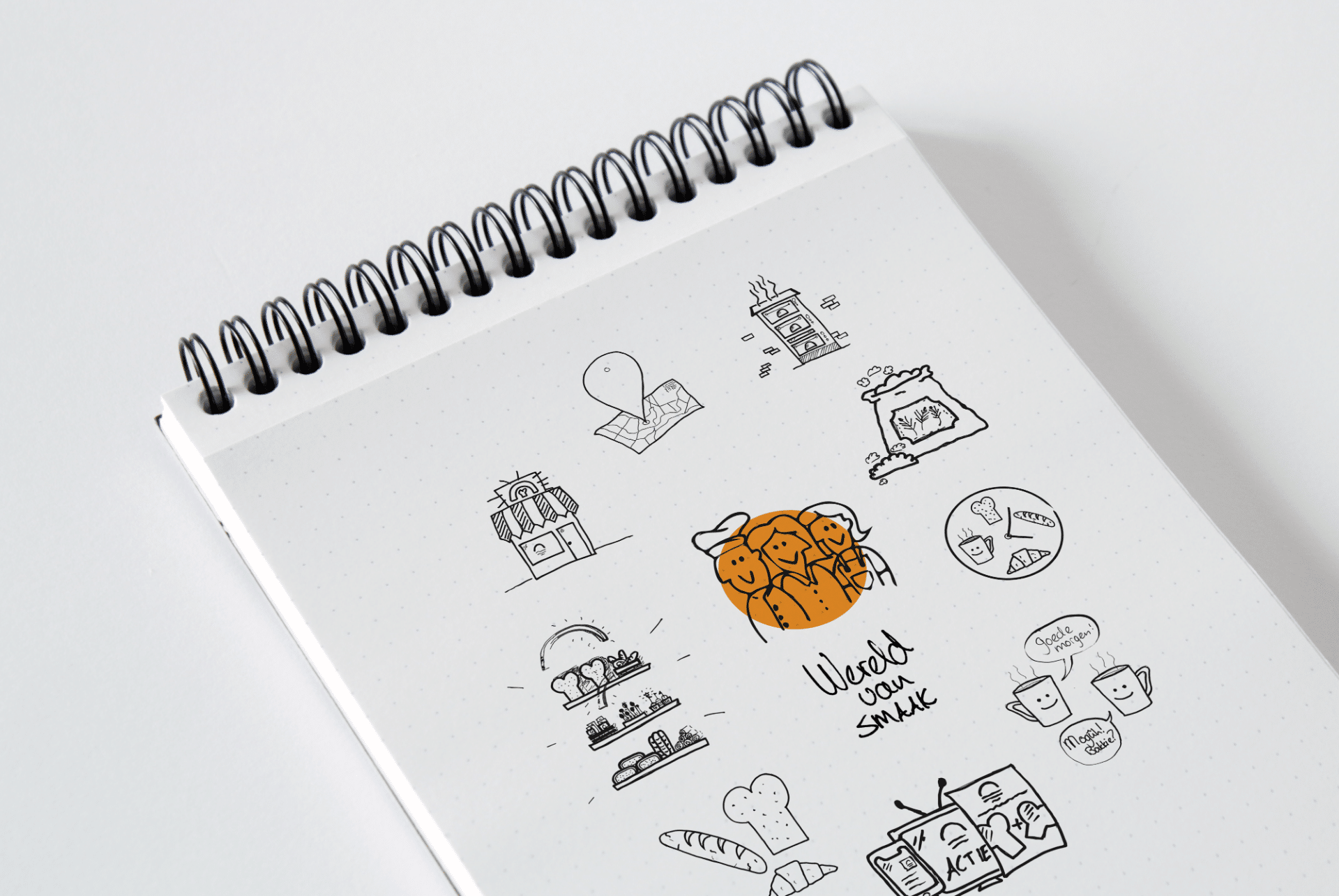
From research we came to the realization that there was already too little reason for consumers to include the detour past the bakery in their shopping routine. The creative sessions provided relief absolutely gave the eye-opener that we needed to convince on taste more than ever.
Tasteful products and tasteful looks. Tasteful conversations and tasteful campaigns. From this approach, we started developing a new corporate identity and visual identity for the bakery.
hide
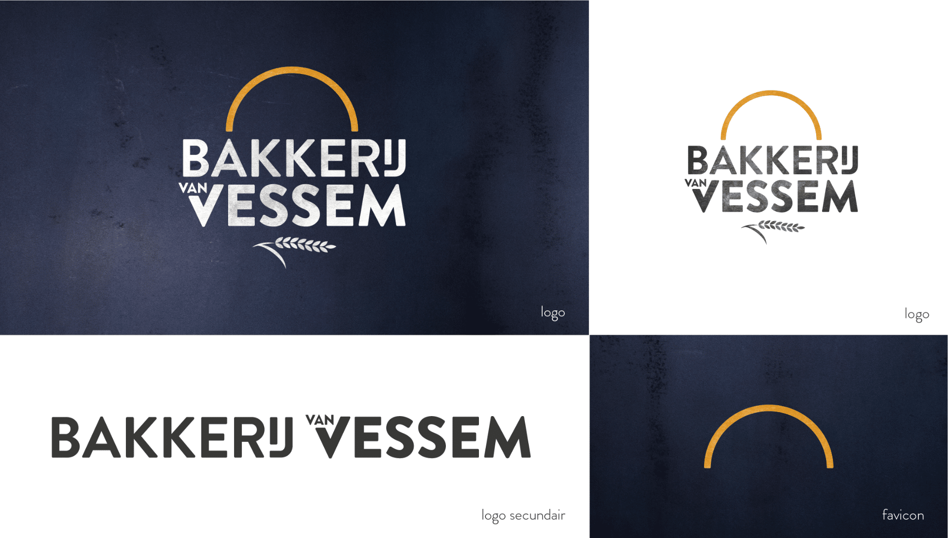
The logo of the bakery is a reflection of all the activities in and around the artisan business. For this, the word Bakker (baker) changed to Bakkerij (bakery), as it is a collective of craftsmen who perform diligent work to bake the tastiest bread. In addition, the sun has been given a prominent place in the logo. The sun represents growth, rising, work and warmth. The baker bakes all day, from early in the morning until late at night.
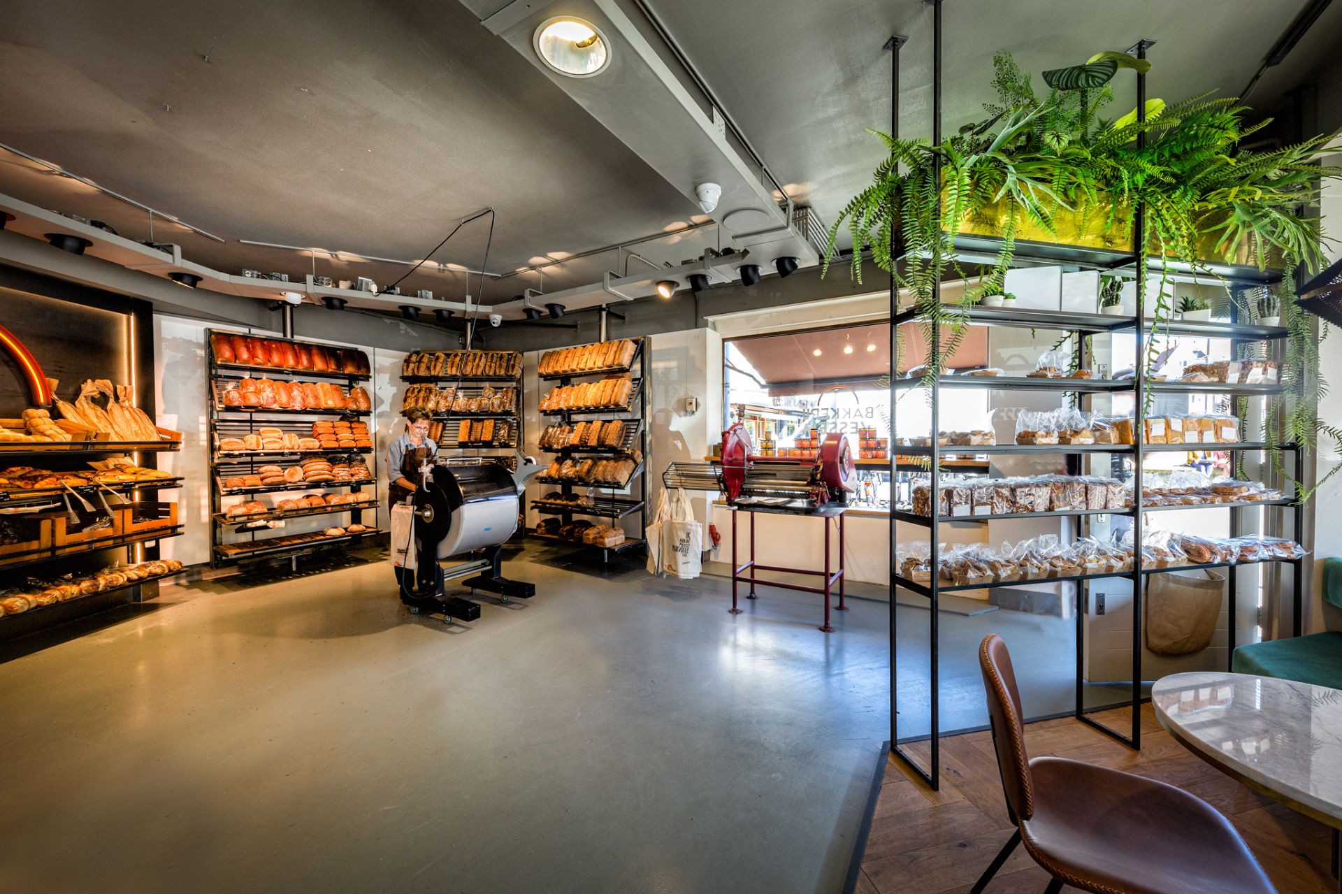
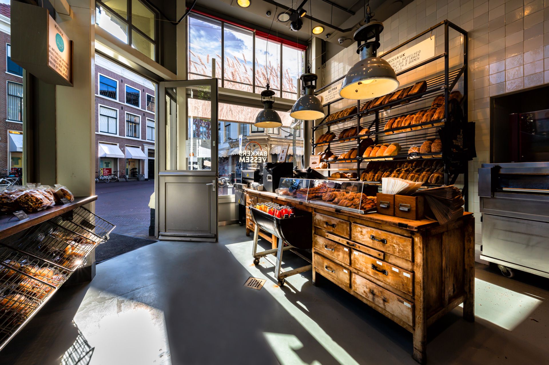
We chose a strategy where we first gave full attention to the internal organization, such as the bakers and store employees. Because we believe that an organization must believe in a new direction from the inside and they ultimately carry the new strategy and corporate identity. The next step was the external strategy and the entire visual identity. This included addressing and completely redesigning the interior, website and signing.
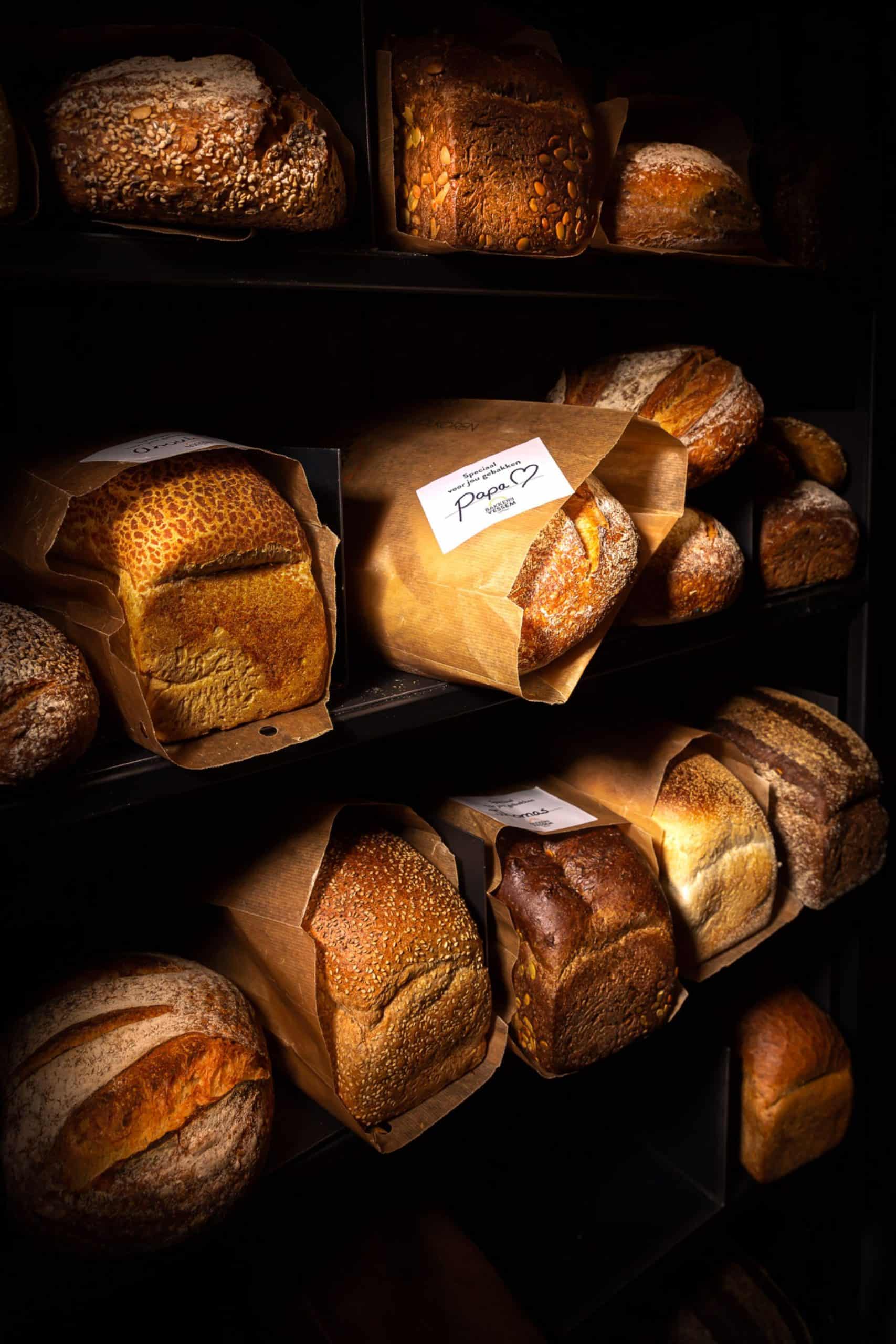
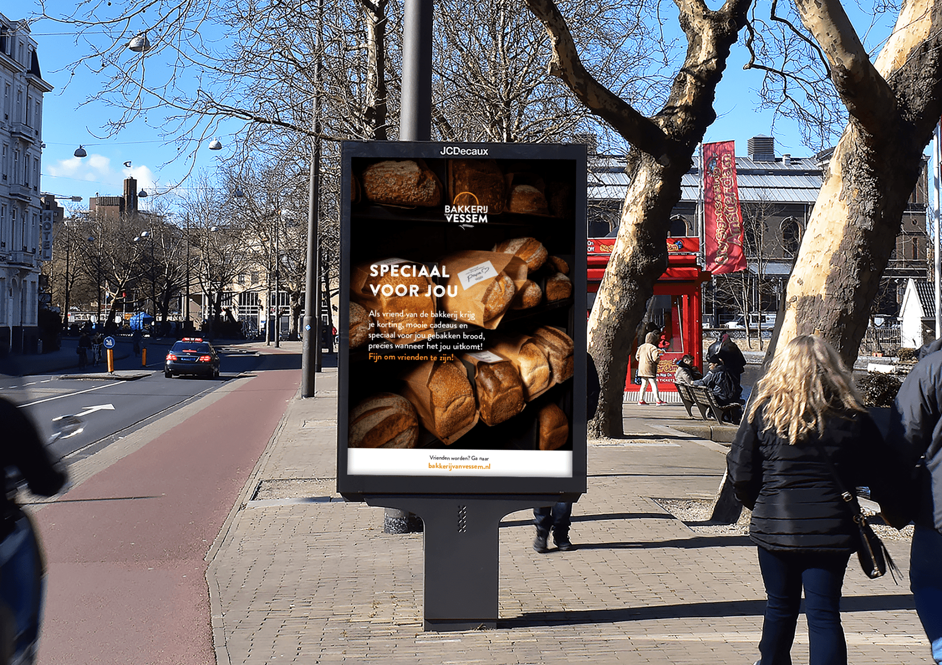
In addition, sustainable packaging was developed for the bakery, some of which can even be added to the compost. To introduce all the elements together, several consumer campaigns were launched.
Throughout the process of the entire repositioning, all stakeholders were closely involved:
- Van Stuk - interior
- Piet Hein Eek - interior design
- Van Nieuwenhuizen - realization signing & print
- Dimensio/Havelaar - sustainable packaging
- Dudesquare - realization website
- Pixeluniverse - rolling out product photography
- MCIS - rollout of marketing materials
